Archives

puma return app case study

Returns App

PROJECT:

Branded Returns Application

ROLE:

Lead Product Designer (UX/UI)

OVERVIEW:

As the online eCommerce market is on the rise year on year, the needs of consumers are also changing and they expect to have a simple and transparent return process if they continue to shop online. It was found through market research that 92% of consumers had a repurchase intent if there was an easy way to return products. The Athlete’s foot (TAF), an enterprise footwear company recognised the changing needs of their consumers and created a partnership with Shippit to utilise their shipping technology to create a transparent and automated return process.

The aim of the project was to build a beta returns product that simplified the return experience for customers to return footwear products by minimising the number of touch points with staff members and speed up the refund process.

______

THE PROBLEM

The current return process for retailers consists of multiple manual touch points and was not scalable with the growth of the business. Without an automated return system in place, it was impossible for eCommerce businesses to track, prioritise, and manage return requests from customers in a timely manner.

They were receiving return requests from customers through email communications and consolidating the information on a spreadsheet manually.

______

USER RESEARCH – QUALITATIVE INTERVIEWS

Conducting user research with multiple types of business was essential to understand the challenges that each of them face. 10 users from different retailers were interviewed based on the segmentation of shipping volume, eCommerce systems, and industry. It was an opportunity to understand the common pain points, motivations, and challenges that many businesses face with handling returns. Data was captured on digital post-it Miro boards which were later used for affinity mapping. See below for examples of the two data sets captured during interviews.
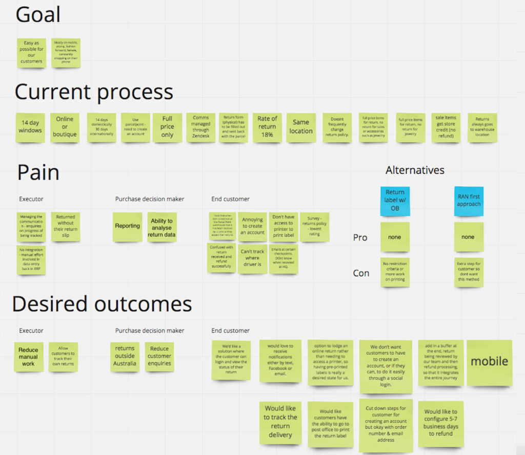
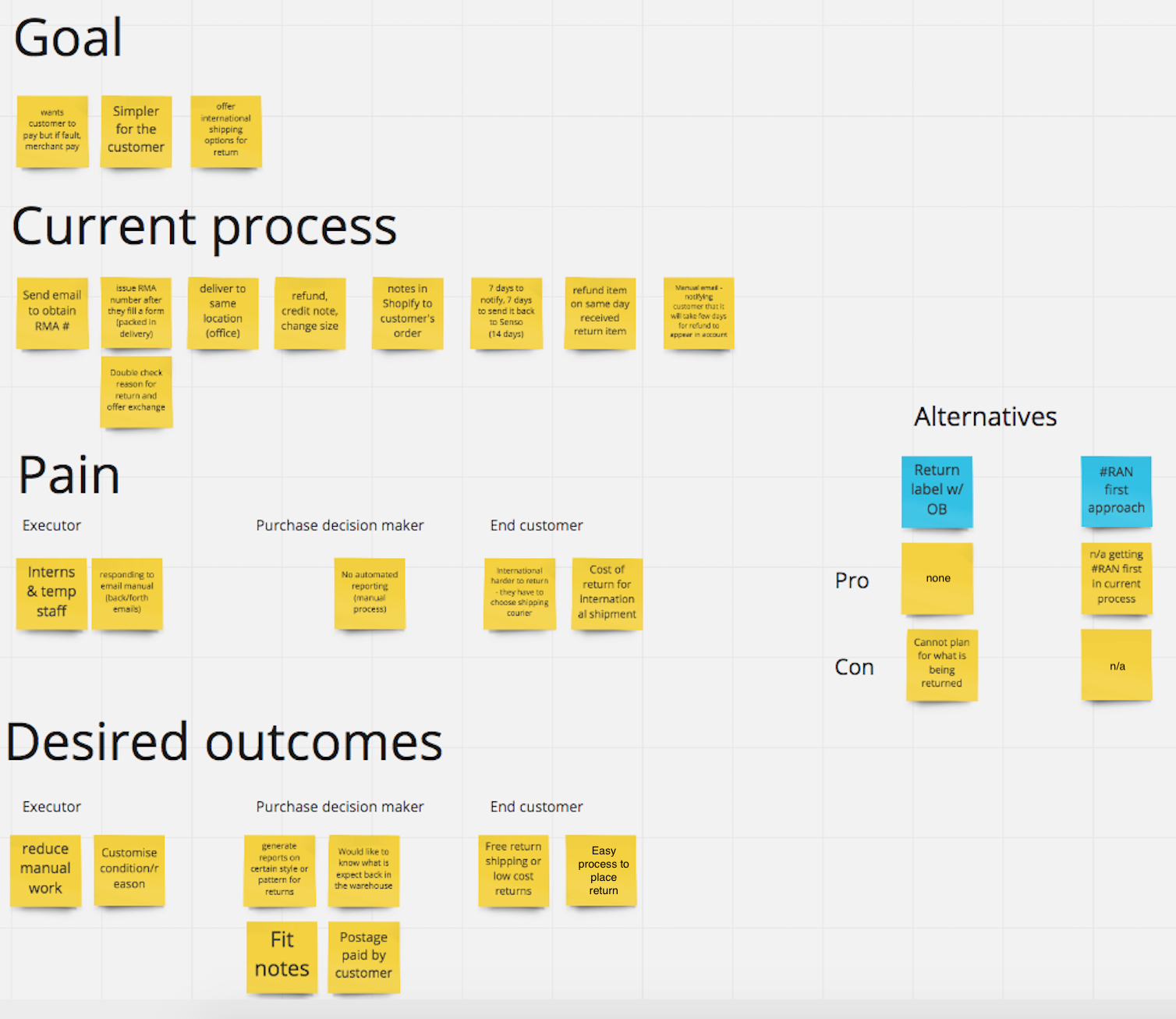
Insights – Pain points

  • Processing and track returns were done using manual data entry where customers often go through several email enquiries to return a product

  • No consolidated system to efficiently track customer returns or centralised view

  • Missing visibility on what products were returned and when they arrived in the warehouse.

  • A full understanding of return shipping costs & commonly returned reasons were difficult to track

______

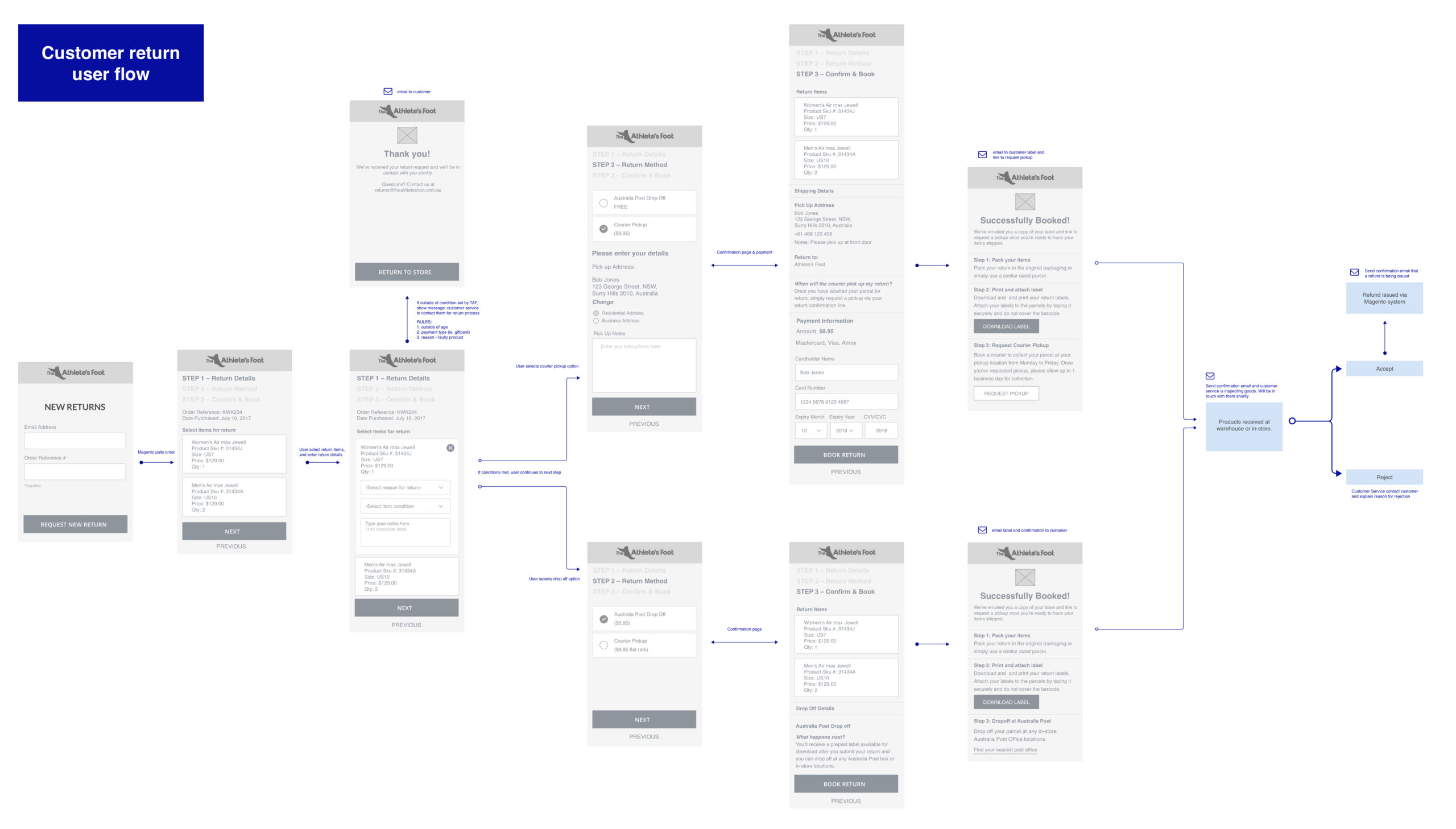
LEAN UX METHODOLOGY – LOW FI SCREENS

Worked directly with Product Managers and Client Stakeholders to rapidly sketch and refine ideas for customer workflow screens. Low-Fi designs were used for quick prototyping and was easy to make various iterations based off user’s feedback quickly.
______

THE SOLUTION

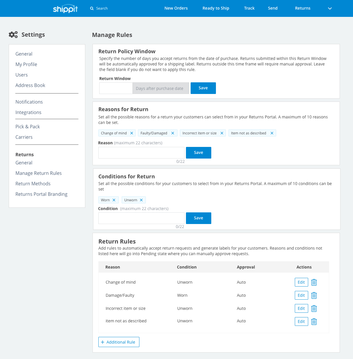
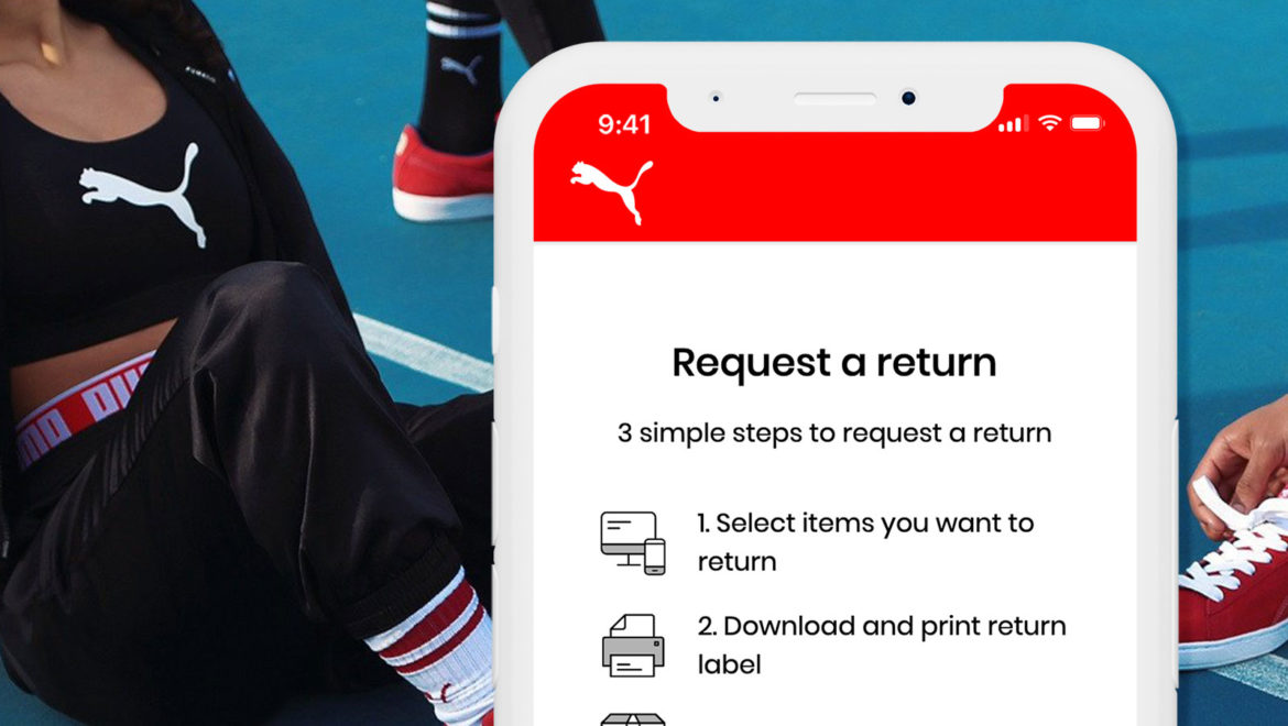
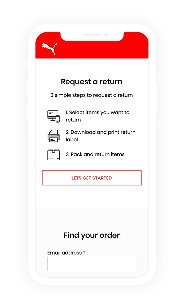
To design a completely new returns product to improve the user experience for customers and retailers. Retailers can set their own return reasons and conditions in the application so they can capture customer data that determine approval or rejections of a return request.  The business rules play an important role in automating the shipping label generation for customers. This eliminates the need for staff to manually email shipping labels once an order is approved for return since the system will be directly integrated with couriers to retrieve shipping labels. The branded Return’s application enables customers to easily create a return request with 3 simple steps using email and reference number as unique identifiers when retrieving the original order. Retailers has visibility of reach return status and can easily manage the orders using Shippit’s return management platform.

______

BETA SCREEN DESIGNS
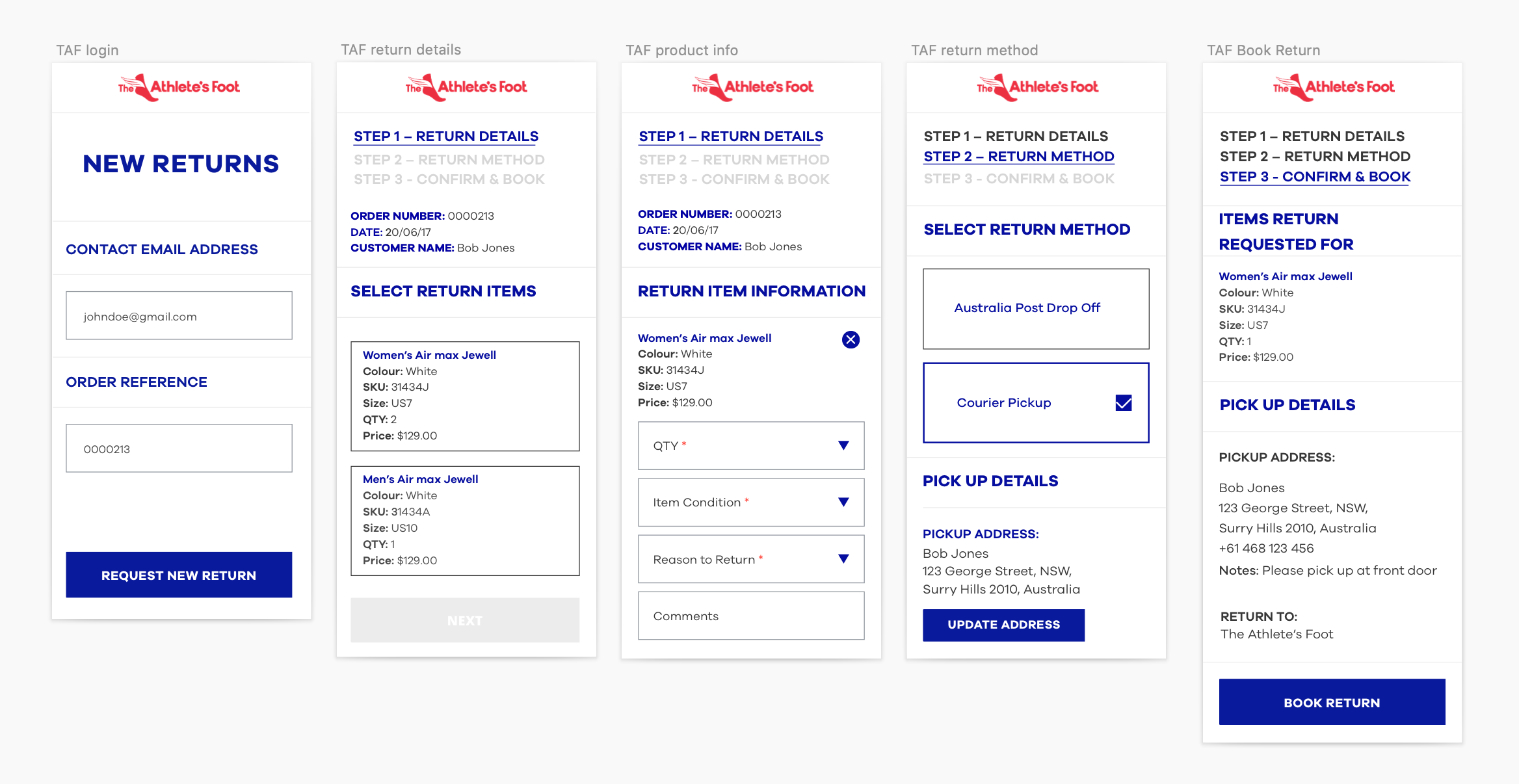
View Beta Prototype here: https://invis.io/FGD1ZU8JU

______

USABILITY TESTING

Several rounds of usability tests were conducted with users who shop regularly online and have experienced posting returning products back to retailers.

Insights:

  • 80%  users preferred a drop off return method – post box or newsagency
  • Users wanted the ability to view return policies before submitting a return request
  • Users were unsure what to expect when selecting courier pickup as an option for return
  • No visibility of when the couriers are expected to arrive to pick up the package
  • Majority of users prefer to use mobile to create a return request

______

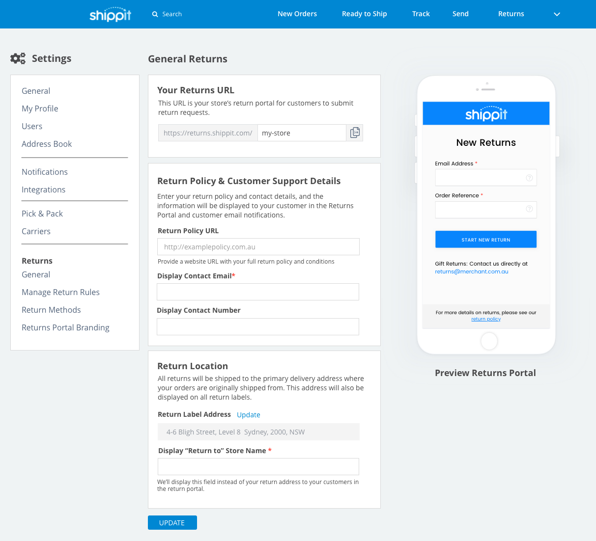
ADMIN SETTING DESIGNS
______

USER INTERFACE DESIGNS

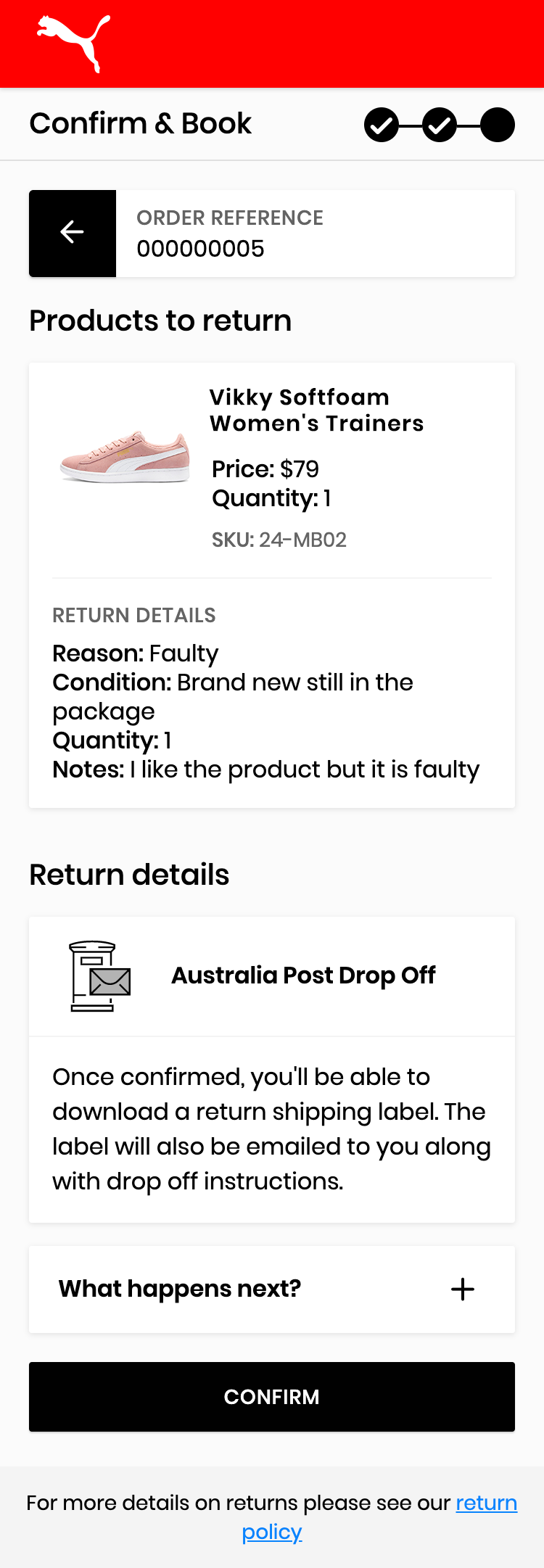
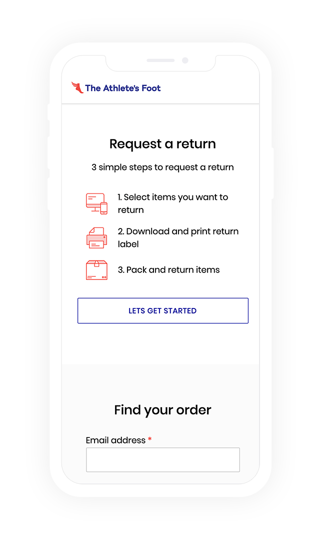
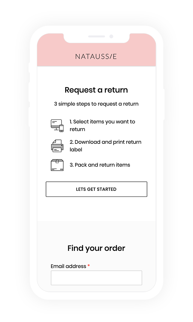
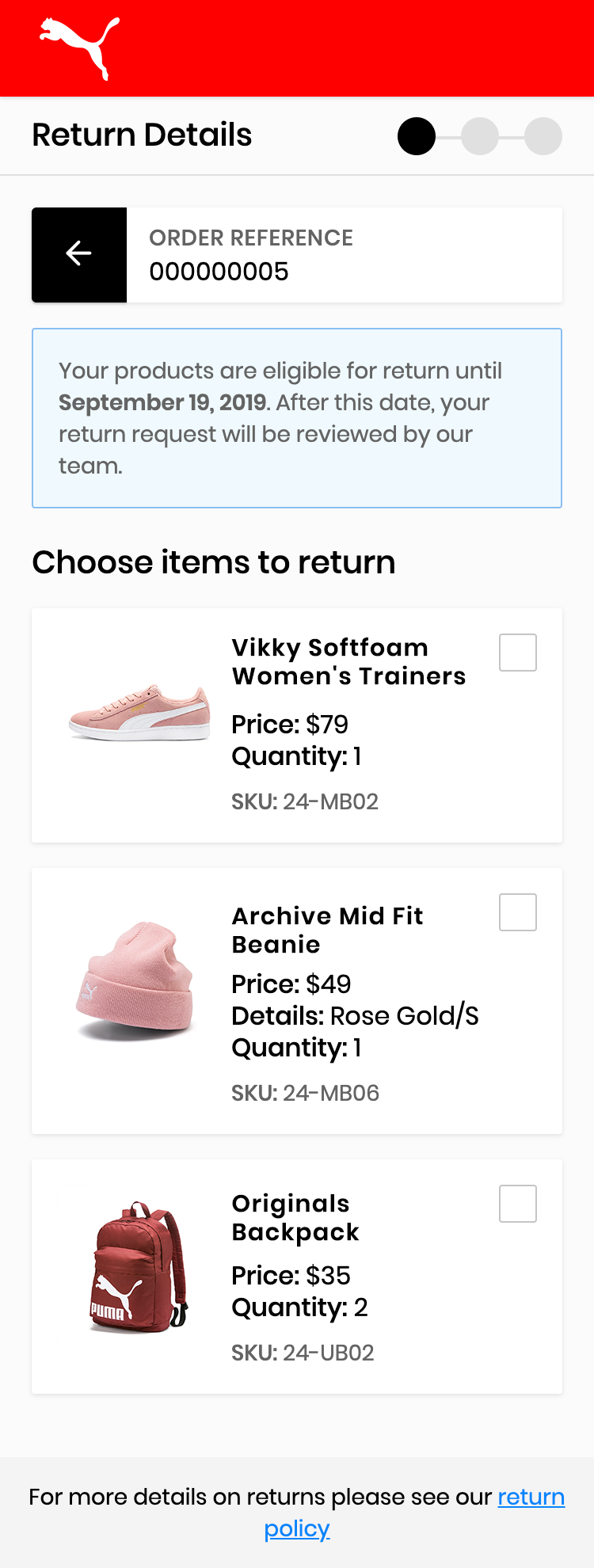
Taking the learnings and feedback from the pilot launch with TAF and PUMA, the returns product went through a redesign to enable customisable components that enabled branding customisation to certain elements in the application. The updated design also provided a much richer mobile experience for customers with carefully thought out micro interaction designs.

______

EXPERIENCE RETURNS 

The customer return screens were animated with Principle to show the workflow and the interactive designs in a mobile experience. The following process shows how a user can login to request a return online, download the return label, and select drop off or pick up as a return method.

____________

BRANDED RETURNS

Woolsworth campaign designs

Woolworths

PROJECT:

Digital Campaigns | Woolworths

ROLE:

Senior Digital Designer

Creative Direction, Low-Fi Sketches, Responsive Visual Design

OVERVIEW

Improving the user experience through targeted landing page for Woolworths’ customers while meeting business objectives.

______

HEALTH & LIFESTYLE

We introduced a landing page targeting personas that shop more consciously. The type of category cards were selected based on customer data and how often they search for a particular food categories . The landing page provides an improved user experience to the customer and enables them to quickly find different categories of interest, view recipes associated, and add all products to their cart in a single click.

Adhering to the existing design system, I provided creative direction in photography and designed the visual layout for the landing page while working directly with the front end developer on implementation. Each card designed can be reused across the website for promotions or other related campaigns.

______

BNI CAMPAIGN

Working collaboratively with a team of digital designers in WooliesX, I’ve lead the creative direction and user journey of how we can get more customers involved successfully with the campaign. The goal of the campaign was to get more customers shopping more often within the length of the campaign so they can be entered for a chance to win the weekly prizes. Below are the final design assets I’ve designed for the campaign.

______

GLORIOUS FOOD RANGE

Provided creative direction on the introduction of a new product range in Woolworths and worked collaboratively with front end engineer on executing the digital assets for the campaign.


ux_fulfilment_casestudy

UX Warehouse Fulfilment

PROJECT:

Warehouse Order Fulfilment | Shippit

ROLE:

Lead Product Designer
User Research, Interaction, Visual design, Prototyping & Testing

OVERVIEW:

The current fulfillment process for small to medium retail businesses is very manual and requires staff to physically memorise items to keep track of orders. As a result, incorrect items were being picked, packed, and sent to the end customer.

Problem Statement: How might we identify areas to minimise human errors within the fulfillment process in the warehouse so that the users can accurately fulfill customers orders faster.

______

DISCOVERY RESEARCH

Research Method: Qualitative user research interviews on-site visits with 3 companies (Retailers & Third Party Logistic Warehouse)

Interviewees: Warehouse Managers, Pick & Packers, Stockists

Documentation: Photographs of warehouse site visits, recordings of user interviews, Task observations

Data Synthesis: Affinity Mapping

Learnings: Users were frustrated at orders being mislabeled or misprinted causing mistakes when sending out customer orders. Pick and pack process were normally separate work flows but the tasks were completed by the same person. Manual steps were prone to human errors

______

PERSONAS

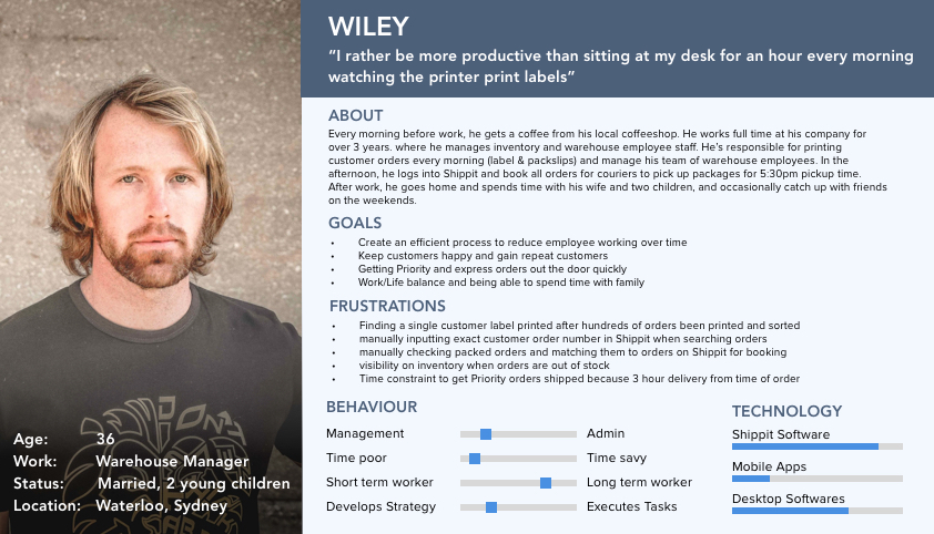
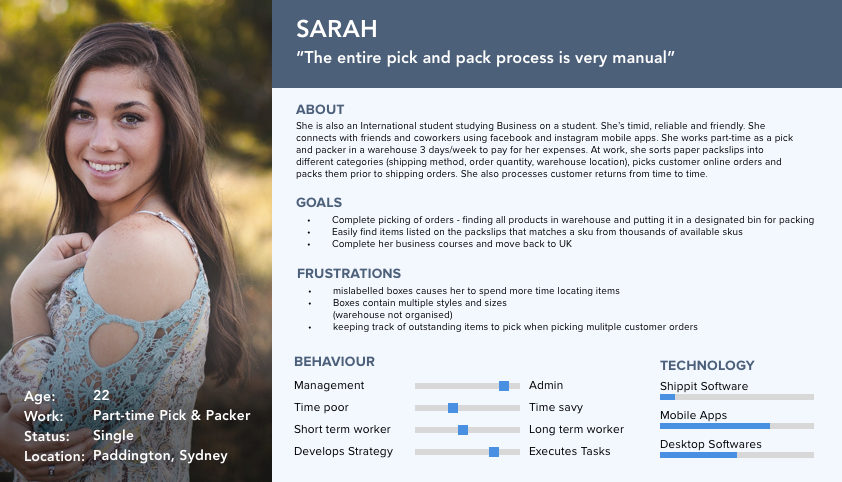
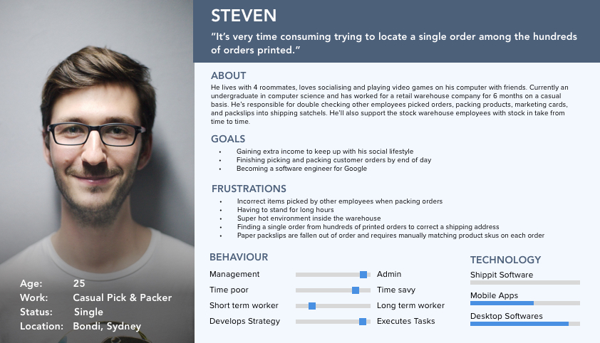
Based on the user research, there were 3 main types of users within the fulfillment process for retail businesses. Although the pick and pack work flow tasks were completed by the same user, separate users personas were created to highlight separate goals and frustrations.

______

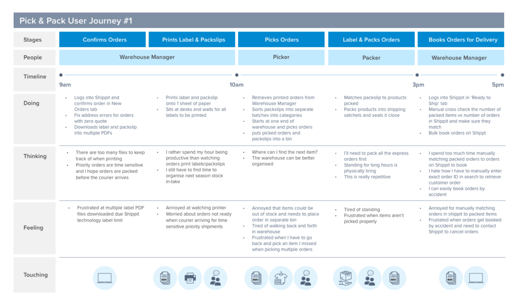
USER JOURNEY – FULFILMENT PROCESS

The order fulfilment process was mapped out to understand the current steps involved, where each person played a role, and their pain points so we identify areas of opportunities to improve the user experience.

______

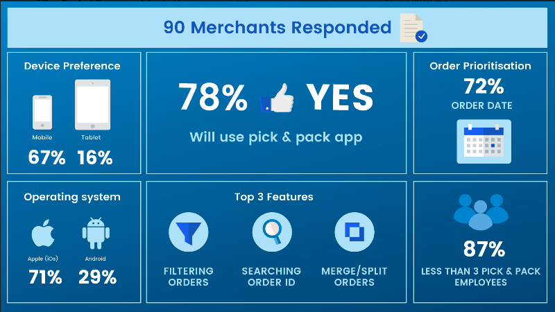
QUANTITATIVE RESEARCH RESULTS (SURVEY)

Based on the qualitative data gathered in numerous user interviews, a survey was sent out to a database of users on Shippit’s platform to prioritise the top features within the application, preference in device, and to gain a better understanding of the number of users in various business segments. Below are the results of 90 respondents with majority of them being small to medium businesses.

______

SOLUTION

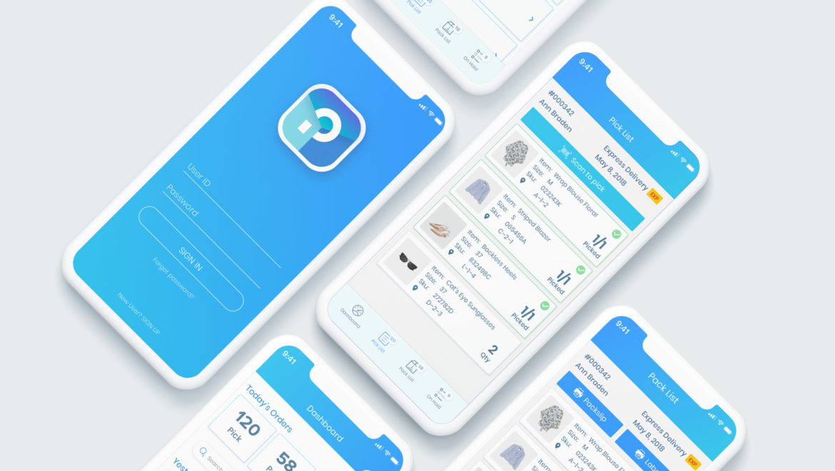
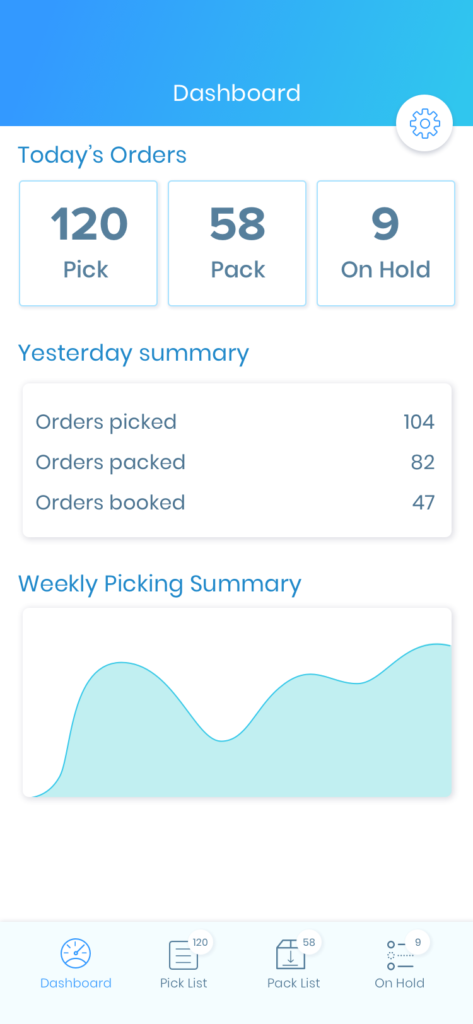
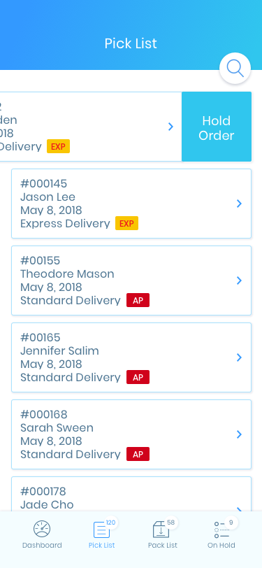
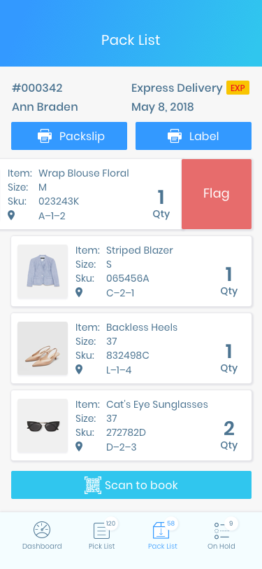
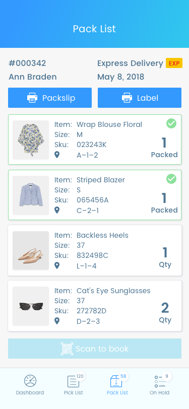
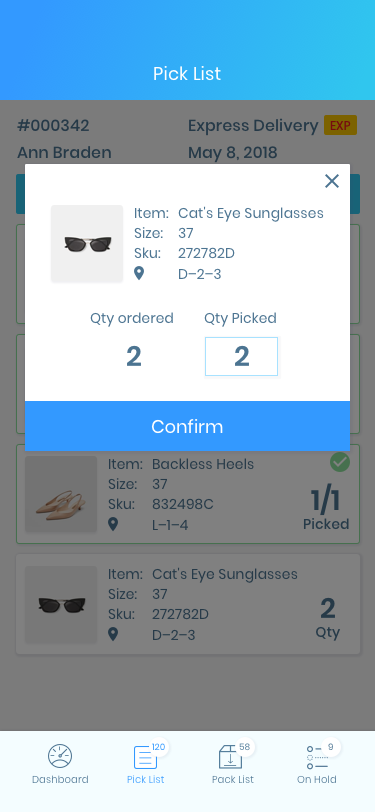
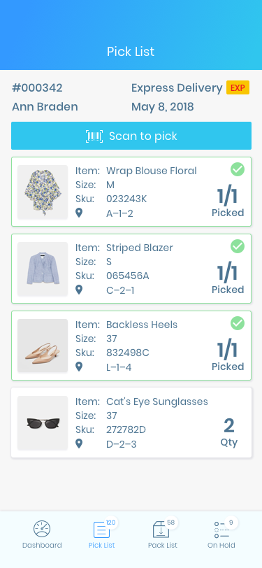
Based on the research and areas of opportunities that provided the most value, I’ve decided to design a technology solution that would semi automate the fulfillment process using a mobile application. The mobile application would need to be easy to use with minimal training based on the personas of a pick and packer. Below are some of the key features required for the mobile app.

______

SERVICE MAP

Mapping the swim lanes between technology and various users helped pinpoint the areas where the solution would help reduce human errors within the fulfillment process. Also, it helps stakeholders have an understanding of various touch points across systems and users that the application impacts.

______

SKETCHES/LOW-FI WIREFRAMES

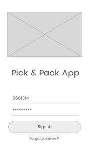
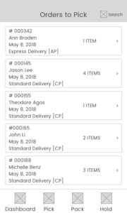
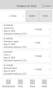
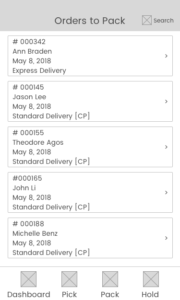
Using a sharpie and paper cut into mobile screens were used to quickly ideate on the work flow solutions. These paper screens were used for quick Guerrilla Usability Testing to quickly gain feedback and iterate on the designs. Sketches were then converted into digital screens for prototyping using Sketch.

______

VISUAL INTERFACE DESIGNS
Prototype: https://invis.io/C6J2I7IUWGY

______

RESULTS
Strategic product roadmap initiative

The initiatives were presented to stakeholders at Shippit and have since approached external agencies to scope out the work required to build the mobile minimal viable product. Shippit now has a data driven strategic initiative on the product roadmap to improve the current pick & pack process for small to medium retail business. The data also helps the business understand which features user’s value most within the application and the prioritisation of the required APIs to support this.

______

LEARNINGS

Seek out feedback early and continually

Reflecting back at the project, a close collaboration between cross functional teams during each of the design phase by running internal workshops and ideation sessions across Sales, Support, and Engineering team could spark further innovative ideas from different perspectives of the business. Also, keeping the engineering team in loop to understand technology constraints and/or difficulties would saves ample amount of time of re-work required to build each feature.

Simplicity is key

As a designer, we are often lured by attractive, trendy and most up to date designs. However, we must bring ourselves back to the ‘why’ and how we can solve the user’s problems. The primary goal is to understand the user, their pain points, and ideate on a design that solves the root cause of the problem.

VGH Foundation

PROJECT:

Donor wall and touch screen display exhibit at VGH & UBC Hospital

ROLE:

As the Lead UI Designer for this project, I worked closely with the Creative Director and Software Engineers on the interface designs and implementation for the digital touch screen exhibit.

CHALLENGE:

Designing a seamless experience between the 42-inch digital touch kiosk screen and the physical donor wall with accessibility in mind with existing branding guidelines. The designs must be accessible for both the Chinese and Western demographics, and inclusive of wheelchair users. The design requires reusable user interface components for consistency and flexibility when adding more stories as the number of donors rise in the future.

BACKGROUND:

VGH & UBC Hospital Foundation has partnered with donors to provide the funds essential to ensure that our hospitals and health care teams can deliver BC’s best, most specialized care for adults. UBC Foundation recognizes those who have donated $10,000 or more on each of the walls located at VGH, GF Strong, and UBC Hospital.

______

UI ELEMENTS

Two sets of navigations were designed to suit the variety of demographics at the hospitals where screens were installed

The icon button is used to reference the location of a donor’s names on the physical wall

______

UI DESIGNS

______

EXHIBIT INSTALLED AT VGH

SOLUTION:

Designed the navigation bar located at bottom of the screen for wheelchair accessibility with a single click to give the ability to toggle between languages of Simplified Chinese and English. The home screen was designed using a card layout with vibrant colours that align with UBC & VGH Foundation’s branding guidelines so different categories and images can easily be replaced. From a user’s perspective, this gives consistency upon landing on the home screen where they can easily navigate to a point of interest. To encourage exploration on the kiosk, various donor stories were displayed along with navigation buttons accessible for users of various heights, and a drag-able touchscreen keyboard. A CRM was also integrated to allow the expansion of more donor names and stories to be displayed in the exhibit as the numbers grow.